The Formatting panel is a context-sensitive panel from which you can set formatting preferences for your visualization. This includes the visualization colors, plotting area, slicers, legends, axes, titles, and more.
The formatting panel is designed to be used in conjunction with the formatting selector. This transforms the canvas into an intuitive, point-and-click formatting area. Hover your cursor over the components on the canvas to highlight those components for selection. Clicking an "activated" component opens its formatting options in the Formatting panel.
Accessing the Formatting Panel
The Formatting panel can be opened and pinned as needed.
-
From the left-hand Toolbox, click Formatting Selector.

This transforms the canvas into an intuitive, point-and-click formatting area. Hover your cursor over the content items on the canvas to highlight them for selection.
-
Click the content item that you want to format.
Clicking an "activated" component opens its formatting options in the Formatting panel.
- Update the formatting options as appropriate to your requirements.
For details about the Formatting Panel options, see The Formatting Panel.
Tip: Instead of following the preceding steps, you could also open the Formatting panel for your visualization by:
- Clicking Format Visual on the Component ribbon.
- Expanding the Formatting panel from the workspace tabs.
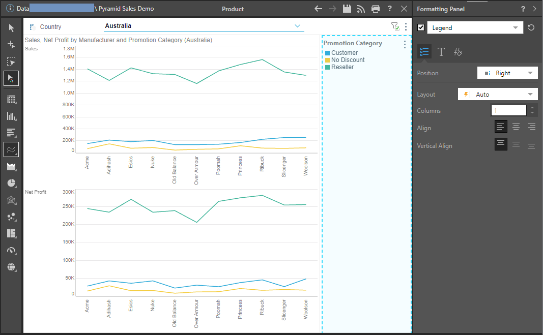
The Formatting Panel
The Formatting panel displays formatting options for the current visualization type. If you're working on a grid, grid options are shown; if you're working on a pie chart, formatting options for pie charts are shown; and so on.
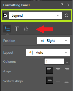
- The panel includes a Component drop-down (green), where you can select different components that you would like to format, like Report Title, Data Labels, Legend, and more.
- Depending on the selected component, there are multiple tabs (red arrow) of formatting options, with each tab addressing different formatting needs for the selected item. For example, when a legend is selected, there are tabs for general settings, the legend's title, and so on.
Specific Visual Design Options
Many formatting and design capabilities are specific to certain visualization types only. To learn about formatting and designing each type of visualization, review the subtopics below:
- Grids: learn about general grid formatting, and extended grid formatting for advanced users.
- Cartesian Charts: includes all charts under the column, bar, line, and area chart menus.
- Segment Charts: formatting for pie, doughnut, pyramid, and funnel charts.
- Plotted Charts: formatting for scatter and bubble charts.
- KPI Charts: design and formatting for KPI gauges and bullet charts.
- Maps: bubble, shape, geo heat, and layered maps.
- Advanced Charts: formatting and design for tree map, circle packing, Sankey, word cloud, sunburst, and icicle charts.
- Custom Visuals: formatting and design for custom build visualizations.